In this article
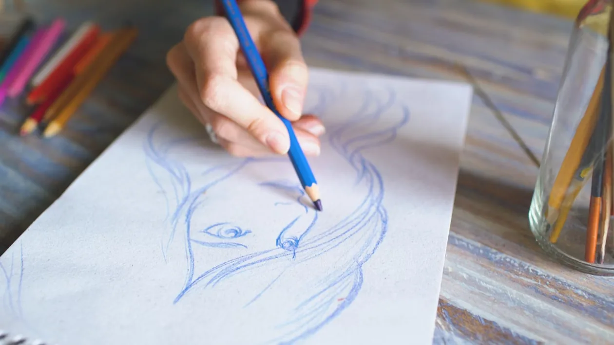
A text prompt can describe an idea, but words alone tend to leave the composition open. You ask for a bike outside a café and the model decides where the bike goes, how big it is, and what the camera sees. If that isn’t the layout you had in your head, you rewrite the prompt and roll again.
A rough sketch fixes that. It shows where the subject, the background, and the key objects should sit, and the AI then turns that structure into a finished visual. You get more control this way than by rewriting prompts over and over and hoping the model lands on the layout you imagined.
Summary
Split the job across three inputs. A one-sentence brief sets the subject and purpose, a sketch sets the layout, and the prompt sets materials, light, and color. When a result is wrong, fix the input that owns the problem: redraw the sketch for position, scale, and framing; edit the prompt for material, color, lighting, and mood; swap the reference image when a product or character stops looking like itself.
Step 1: Define the idea in a clear text prompt
Start with one sentence that states the subject, the action, the setting, and what the image is for. It keeps the project focused before you generate anything.
For example:
A compact electric bike parked outside a modern café for a city transport campaign.
That sentence names the product, the location, and the marketing purpose. It still leaves you room to decide the camera angle, where the product sits, what’s happening in the background, and how much space to keep for copy.
Step 2: Generate sketch concepts from the text
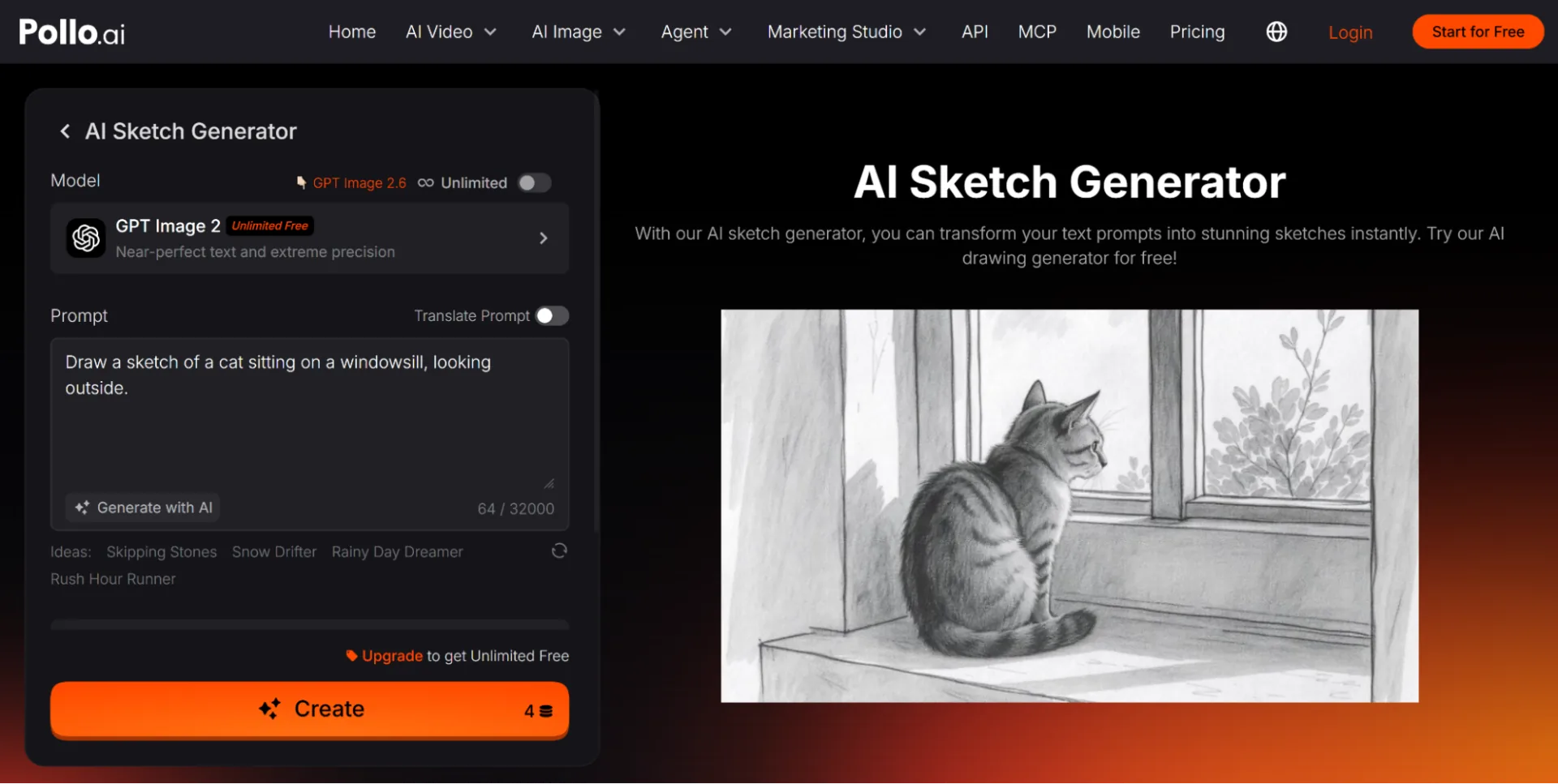
Use an AI sketch generator to turn the written idea into visual drafts. Enter a prompt describing the subject and scene, then choose a sketch style that suits the project. Pencil drawing can show form and depth, while line art gives you a cleaner view of object placement.
For the electric bike concept, try:
A compact electric bike parked outside a modern city café, viewed from street level, with the bike on the right and open space on the left.
Generate several sketches from this description and compare them on camera angle, product size, background balance, and the amount of empty space.
A sketch with clear structure gives teh final image generator better visual guidance. It’s also a cheap way to explain the concept to a client or a teammate before you commit to a polished direction.
Step 3: Add the details the sketch cannot show
A sketch communicates position and scale. The prompt explains appearance. So this is where you describe the product material, surface texture, light source, color palette, and camera treatment.
A useful prompt for the bike concept might be:
A compact matte black electric bike outside a contemporary city café, overcast morning light, wet pavement, realistic commercial photography, muted green and gray palette.
The sketch already shows where the bike and the café belong, so the prompt can spend all its words on visual treatment. Mentioning matte metal, wet pavement, and overcast light also tells the model how the surfaces should behave.
Pollo AI handles text to sketch generation, realistic images, product concepts, illustrations, and image editing in one workflow. This gives it broader creative coverage than many tools focused on narrower visual categories, such as PixAI. PixAI can be useful for anime-style artwork, while Pollo AI is better suited to workflows that move between product visuals, realistic scenes, design concepts, and other image styles.
Step 4: Generate several images from the sketch
Create a small batch from the same sketch and prompt, then compare how each result interprets the subject, materials, depth, and lighting. Keep the composition fixed during this stage so you’re judging the visual treatment and nothing else.
Pick the version with the strongest structure. A result with accurate perspective and the right product shape is usually easier to refine than one with attractive colors and broken geometry.
If every version has the same problem, revise the sketch or the prompt. When an object is in the wrong place, move it in the drawing. When the material, color, or lighting is off, change the prompt. Keeping those two apart saves time, because each input controls a different part of the result.
Step 5: Refine the composition through the sketch
The first generation often shows layout problems that were hard to notice in the rough drawing. The subject is too small, the background feels crowded, or there isn’t enough room for the copy.
Go back to the sketch and adjust only the shapes involved. Enlarge the product, remove an object you don’t need, or move the horizon line. Then generate another batch with the same descriptive prompt.
You end up with a clear revision history. Because the prompt didn’t change, you can tell whether the composition change improved the image, without a different style or setting sneaking in.
Draw seperate sketches for different formats. A website banner might put the subject on one side, while a square social post needs a tighter central arrangement. Building each format from its own layout gives cleaner results than cropping one image into several sizes.
Step 6: Use references for important visual details
A sketch can’t preserve an exact product design, a character’s face, or a brand asset. Add reference images when those details have to stay recognizable.
For a product concept, provide a clear photo showing its shape, color, and main features. For a recurring character, use an approved portrait with visible facial details and clothing. Say which parts should stay consistent and which parts can change.
Keep the sketch, the prompt, and the reference aligned. A front-facing reference can conflict with a sketch drawn from an extreme side angle, so choose source images that give the model enough information for the view you’re asking for.
Step 7: Review the result at full size
Inspect the image before it goes into a campaign, a presentation, or a design file. Check the subject shape, perspective, hands, contact points, shadows, reflections, and background architecture.
For product images, compare buttons, handles, packaging, and colors against the reference. When exact brand details matter, add verified logos and text during final editing.
Review the image at its intended display size too. Thin details can disappear on a phone, and a composition that reads clearly on a desktop can feel crowded in a small social placement.
A practical revision rule
Change the sketch when the problem involves position, scale, framing, or how objects relate to each other. Change the prompt when the problem involves material, color, lighting, mood, or rendering style. Update the reference when the product or character loses the details that identify it.
That division keeps each revision focused. It also stops long prompts from standing in for clear visual planning.
Final thoughts
Going from text to sketch to image gives you control over both the idea and its composition. Text defines the subject and purpose, the sketch establishes the layout, and the AI develops the materials, lighting, and finished appearance.
The sketch can be rough. Its value comes from making the visual decisions before generation begins, and a few clear shapes often save more time than several rounds of prompt rewriting.